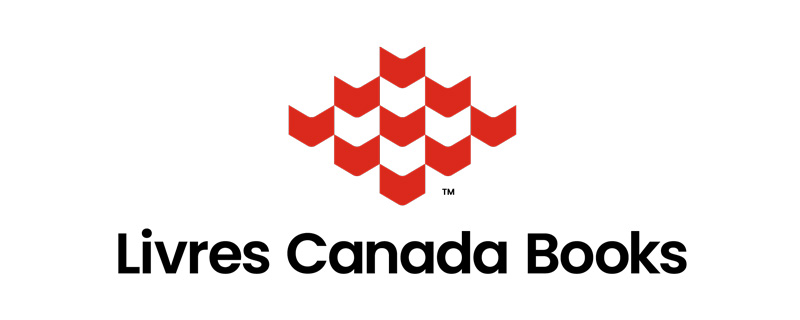
We are delighted to share our new brand identity and logo to our industry partners, stakeholders, and friends.
As an organization that aims to serve all Canadian publishers, our new logo is a symbol of our collective strength, suggesting ideas of growth and a sense of building community—both amongst Canadian publishers and with international industry at large.
Livres Canada Books began developing a new brand identity in late 2020 when we noticed a need for greater flexibility and accessibility from our logo and wordmark as we revamped the look of the Rights Canada catalogue, developed a new website, and experienced a much greater online presence. And, through the new brand development process, the designers were able to tease out the core elements of Livres Canada Books’ identity and values.
The new logo includes multiple signatures for more flexibility and our wordmark is now set in mixed-case lettering for greater legibility and accessibility.
The logo uses a very familiar book icon as its base. The graphic, made up of shapes resembling open books, is arranged so that the visible books—inclusive of the solid red and interlocking white spaces—equal 13, representative of the 10 provinces and three territories that make up Canada. The lack of bounds around the shapes also suggests that the pattern could build forever, further supporting the idea of growth.
The new brand also introduces a new range of colours in primary, secondary, and supporting palettes. These colours and their meanings were chosen to reflect the attributes of the brand and its values, and a connection to Canada—from its primary red to the array of supporting colours representing our country’s diverse and beautiful physical landscape.
We thank you for your interest in our new brand identity and logo. For more information on our new branding, please contact Elina Taillon, Communications Officer, by email.
